Available for PC – Win / Linux / Mac
You’ll receive a Steam key for Rail Route directly from the developers of the game.
❤️ Thanks for your great support!
Redesigning the UI
Recently, we have started not an easy task – complete UI redesign. We knew this job needed to be done for a long time as our UI was temporal from the very beginning. But postponing for so long was not a good decision – resulted in tremendous amount of work ahead. Hopefully, we already have the vision on how the UI should look like, thanks to our graphic guy Armando. But it was not an easy task either!
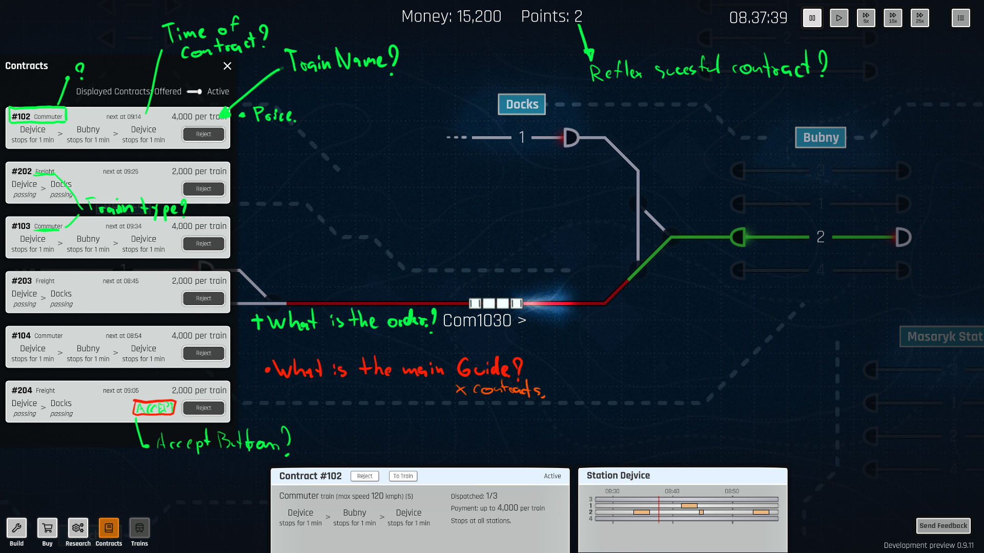
The notes from Armando
The Design Preparations
The first task has been mapping of the current state – what kind of UI controls we actually have in the game and what data we are rendering. That process has helped us understand what kind of information we need to present and mainly how these information are connected together. We have created and discussed wire frames to settle on the new and better placement of the crucial components. The main difference you can see is the replaced Time panel that is closer to the bottom detail panels. The player needs to check time very often when working with the detail panels and now she won’t need to move her eyes far to the top right corner on every occasion.

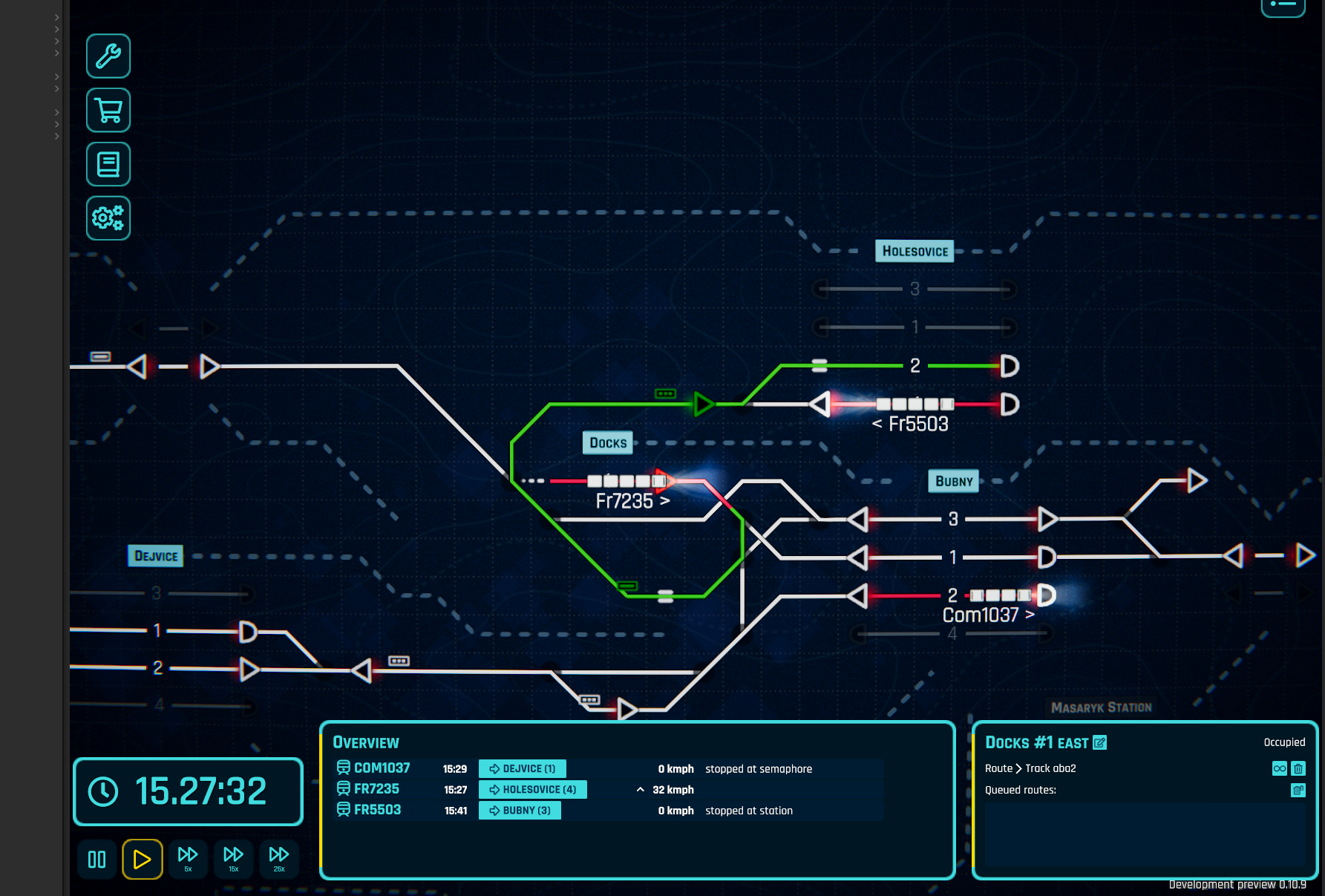
Wire frame of UI proposal
Actual Design
Next step for Armando has been providing us with the new design. For me the UI design is just the small portion of the problem. Yes, it must be pleasant to look at (as it’s visible the whole time) but the most important thing was the user experience. That’s the quality of life of using the UI. Fortunately, we have got a lot info from the preparation step as well as from our great community!
Overview Panel
Within the redesign we also have wanted to solve one big issue – lack of some kind of Overview panel. Something that would help you focus on what currently needs your focus. We already have got the Trains panel in the game but its placement and implementation has not been good. So we have made a new main panel visible at the bottom of the screen. A lot of important information is shown there. If you select a train – the Train detail is shown instead of the Overview. After clearing the selection you see the Overview again. That the main area of the new UI.
Initial state of overview panel
Last but not least we plan the Overview to evolve with the research during your game play. At first there will be just a basic info but later in the game it will provide more useful functionality. As your traffic (and automation) will grow, there will be different items that need your attention.
The Building Icons
While we are finishing the UI redesign being satisfied with the outcome, we still have a few thing to solve. For example, the Building Menu is something that needs one more iteration even after the redesign as it’s not so well arranged.

We hope we will solve these small issues as soon as possible and we will be looking forward to the next alpha preview release of our even greater train dispatcher simulator. Until then, join our discord!
Available for PC – Win / Linux / Mac
You’ll receive a Steam key for Rail Route directly from the developers of the game.
❤️ Thanks for your great support!
[…] on Steam. One big focus of their current effort is on an overhaul of the user interface, which they blogged about on their official site and it’s looking pretty slick and much nicer than the current demo […]
[…] now our focus is on the UI redesign I have mentioned in my previous blog post. Beside it we are changing the contract system dramatically by removing […]